Visualisation of Data using Python
Authors: Darren Teo, Ervin Chia
About the Authors: Year 3 student in NUS in Special Programme in Science, Darren and Ervin are currently majoring in Life Sciences and Physics respectively.
About this tutorial: This is essentially the same example of the R tutorial but repurposed to make use of Python; specifically with the seaborn and matplotlib packages.
CoLab Link: This tutorial is also available in Google CoLab
Other ways of visualizing data: Since this page is not exhaustive, you can check out data to viz for more ways on plotting graphs!
Section 1: Scatterplots, Boxplots and Grouping by Colour
Scatterplots
Importing relevant packages
For this tutorial, we would need to import the following python packages:
import pandas as pd
import matplotlib.pyplot as plt
import seaborn as sns
Loading in iris dataset
For the purposes of this tutorial, we are going to be using the Iris flower dataset introduced by Ronald Fisher in his 1936 paper The use of multiple measurements in taxonomic problems.
There are various ways of loading in the iris dataset in python, but let us load in our own csv file to simulate using our own data, using Pandas.
#I hosted the same dataset exported from R onto my github for easy access
iris = pd.read_csv('https://raw.githubusercontent.com/darren1998s/darren1998s.github.io/1e6564c4a3f501a980b0dc64f943457928b47d8a/iris.csv', index_col=None)
Inspecting the dataset
This dataset contains Sepal and Petal length / width of different Species of flowers Iris setosa, versicolor, and virginica.
We can take a peek at the dataset like this:
print(iris)
| Sepal.Length | Sepal.Width | Petal.Length | Petal.Width | Species | |
|---|---|---|---|---|---|
| 1 | 5.1 | 3.5 | 1.4 | 0.2 | setosa |
| 2 | 4.9 | 3.0 | 1.4 | 0.2 | setosa |
| 3 | 4.7 | 3.2 | 1.3 | 0.2 | setosa |
| 4 | 4.6 | 3.1 | 1.5 | 0.2 | setosa |
| 5 | 5.0 | 3.6 | 1.4 | 0.2 | setosa |
| 6 | 5.4 | 3.9 | 1.7 | 0.4 | setosa |
The next step in exploring datasets is to know and understand what the dif.ferent variables are referring to, such as Sepal Length, Sepal Width, Petal Lengths and Petal Width!
Optional Information
The dataset numbers are all in centimeters (cm), and the different variables should look foreign to people not well versed in plant morphology. Luckily for us, since this is a well-known dataset, the internet has graphics explaining what they are. 
How handy! This website contains an image on what Sepal / Petal length and widths mean for each row!
Pairs plot: Testing a hypothesis
With this dataset, a hypothesis that we could reasonably come up with is that Sepal.Length and Petal.Width are related in someway. We can visualise this quickly by using the plt.plot() function from matplotlib, which we abbreviated as plt:
plt.plot(iris['Sepal.Length'],iris['Petal.Width'], '.')
plt.show()
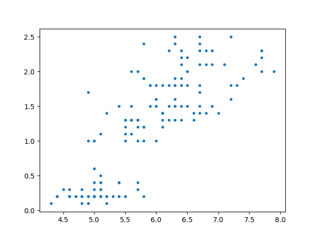
Despite how succint those lines are, there's a lot going in implicitly, so let's take a closer look:
plt.plottakes in many arguments, but 2 are necessary for a meaningful plot: the x and y values. The arguments must either be provided in that order (x then y, as shown in our example here) or explicitly defined asx = iris['Sepal.Length'], y= iris['Petal.Width']in the brackets.- Secondly, the
'.'that follows is a short keyword argument that tellsmatplotlibwhat marker to use; the full stop punctuation is a shorthand representation for the dots you see in the graph. If omitted,plt.plotdefaults to whatever runtime configuration it is currently running.
Awesome! There seems to be some sort of association. What if we want to explore other combinations of our variables, such as Sepal.Length vs Petal.Length or others? Luckily for us Python's seaborn which we abbreviated as sns has a function called pairplot() to help us.
sns.pairplot(iris)
plt.show()
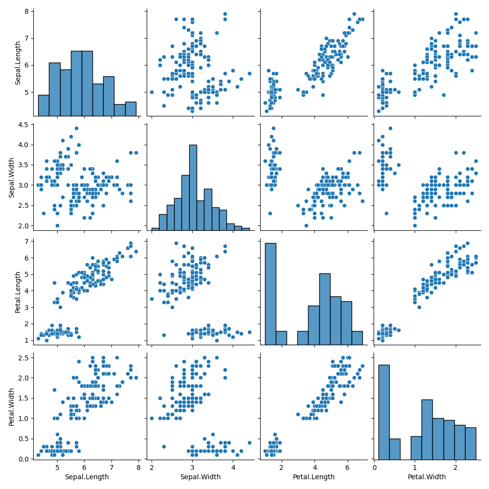
It seems that Petal.Length and Petal.Width has the strongest positive association with each other. This is to be expected as we would expect a flower with a longer petal length to have a longer petal width as well.
It also seems that Sepal.Length and Petal.Length have some sort of correlation as well. Lets use these two variables for our examples later!
Solidifying our research question
Before we proceed any further, it is important in any experiment that we have a solid research question in mind. This is because the type of data presented will help answer your research question.
Lets say we had a basic research question "Are the lengths of the petals associated with the lengths of sepal in I. setosa, I. versicolor, and I. virginica?" So while we're doing data collection, we collected many other variables as well (see table above).
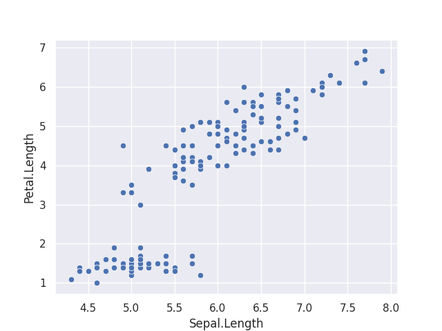
After data collection, we can plot Sepal.Length against Petal.Length using plt.plot().
plt.plot(iris['Sepal.Length'],iris['Petal.Length'], '.')
plt.show()
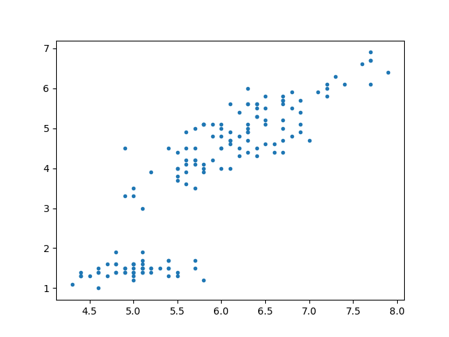
It seems that Petal Length and Sepal Length do have a linear positive correlation with each other!
Scatterplot and Trendlines with seaborn
If you were Ronald Fisher and wanted to present about the positive correlation of Sepal Length with Petal Length by using the graph presented above, you will probably not succeed in getting your point across.
We are going to make use of the various functions in seaborn to plot meaningfully. So be sure to check closely!
We already have our base syntax, where our x-axis is Sepal.Length and y-axis is Petal.Length.
sns.set_theme(style="darkgrid") #This makes the graph dark and shiny by using one of the many themes in seaborn
sns.scatterplot(x = 'Sepal.Length',y = 'Petal.Length', data = iris)
plt.show()
Great, this is the exact same graph as above. Except this has COLOUR. There are a few things we can do to make this graph look more purposeful.
- Label size for the numbers
- Naming of X- and Y-axis
- Title / subtitle
Changing the label size & Naming of X- and Y-axis
The first glaring issue is that the labels on the x- and y-axis are very small and may not be easily readable. Let us change that using functions found in matplotlib:
sns.scatterplot(x = 'Sepal.Length',y = 'Petal.Length', data = iris)
plt.xlabel("Length of Sepal (cm)", fontsize = 20)
plt.ylabel("Length of petal (cm)", fontsize = 20)
plt.xticks(fontsize = 15)
plt.yticks(fontsize = 15)
plt.show()
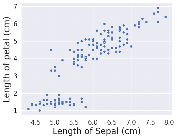
plt.xticks(fontsize = 15) and plt.yticks(fontsize = 15) changes the numbers on the x- and y-axis whereas plt.xlabel("Length of Sepal (cm)", fontsize = 20) and plt.ylabel("Length of petal (cm)", fontsize = 20) changes the size and name of the x- and y-axis labels. Note that the fontsizes we declared and different, and appropriately so.
- Label size for the numbers
- Naming of X- and Y-axis
- Title / subtitle
Now with one look, readers can get an idea of what the graph is about. But to make it even clearer, we will need to add a title to the graph:
sns.scatterplot(x = 'Sepal.Length',y = 'Petal.Length', data = iris).set(title='Length of Petals (cm) vs Length of Sepals (cm)\nof various $\it{Iris}$ flowers')
plt.xlabel("Length of Sepal (cm)", fontsize = 20)
plt.ylabel("Length of petal (cm)", fontsize = 20)
plt.xticks(fontsize = 15)
plt.yticks(fontsize = 15)
plt.show()
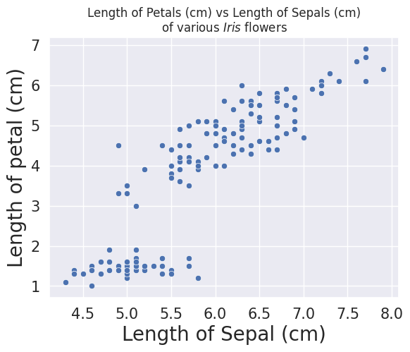
The code snippet .set(title='Length of Petals (cm) vs Length of Sepals (cm)) allows each individual graph to have their own titles, and the snippet \nof various $\it{Iris}$ flowers' allows for a new line (specifically, the \n is a delimiter that is read and understood as a line break, rather than literally as \n. In that new line, we also italacise the word Iris using $\it{Iris}$.
Our checklist is now complete!
- Label size for the numbers
- Naming of X- and Y-axis
- Title / subtitle
Giving meaning to the graph
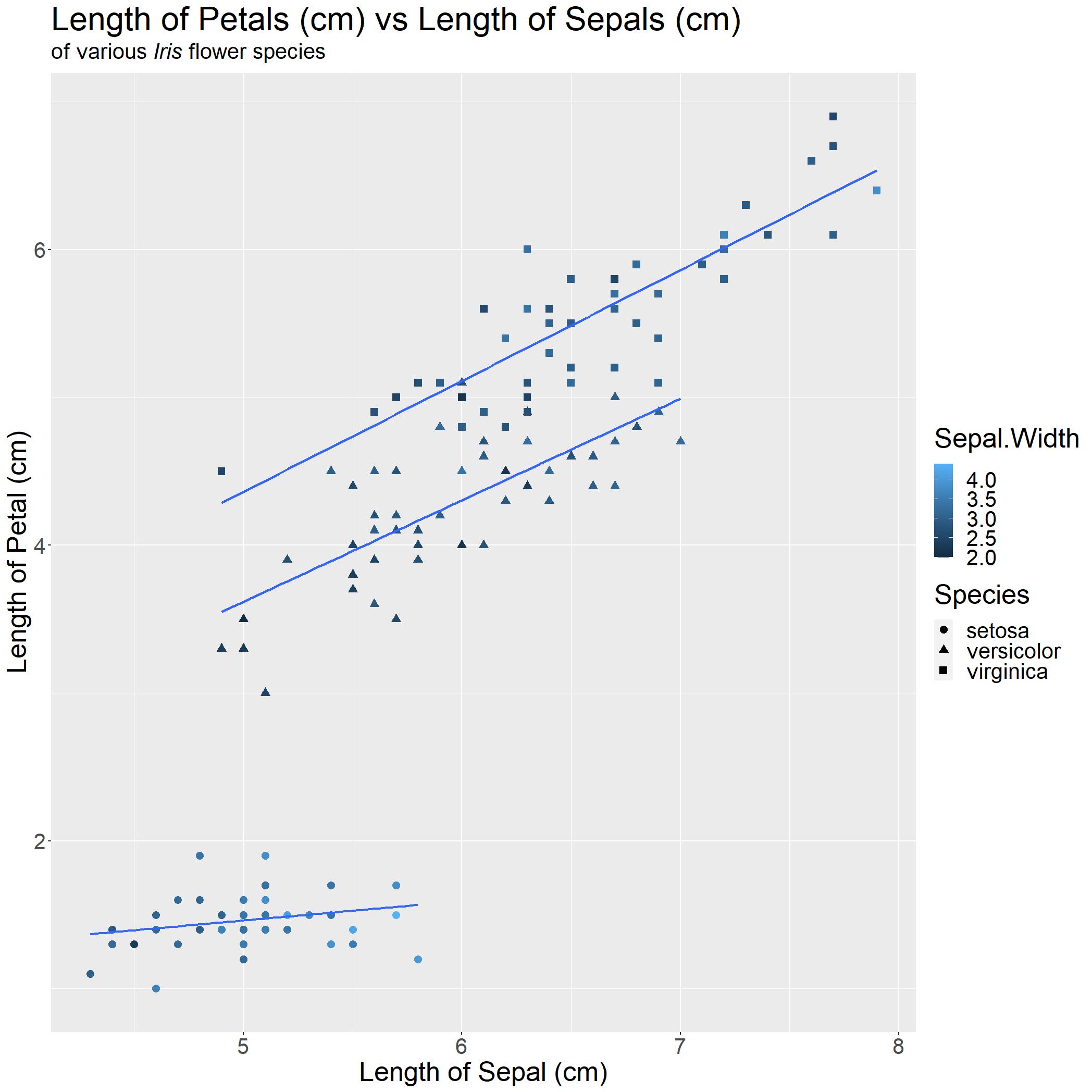
We have a decent graph generated, but it does not really tell the reader anything immediately. Linking back to our research question, we want to show that there is a linear association between length of petal and length of sepal of various Iris flower species. The easiest way we can do this is by adding a best-fit linear regression line!
sns.regplot(x = 'Sepal.Length',y = 'Petal.Length', data = iris).set(title='Length of Petals (cm) vs Length of Sepals (cm)\nof various $\it{Iris}$ flowers')
plt.xlabel("Length of Sepal (cm)", fontsize = 20)
plt.ylabel("Length of petal (cm)", fontsize = 20)
plt.xticks(fontsize = 15)
plt.yticks(fontsize = 15)
plt.show()
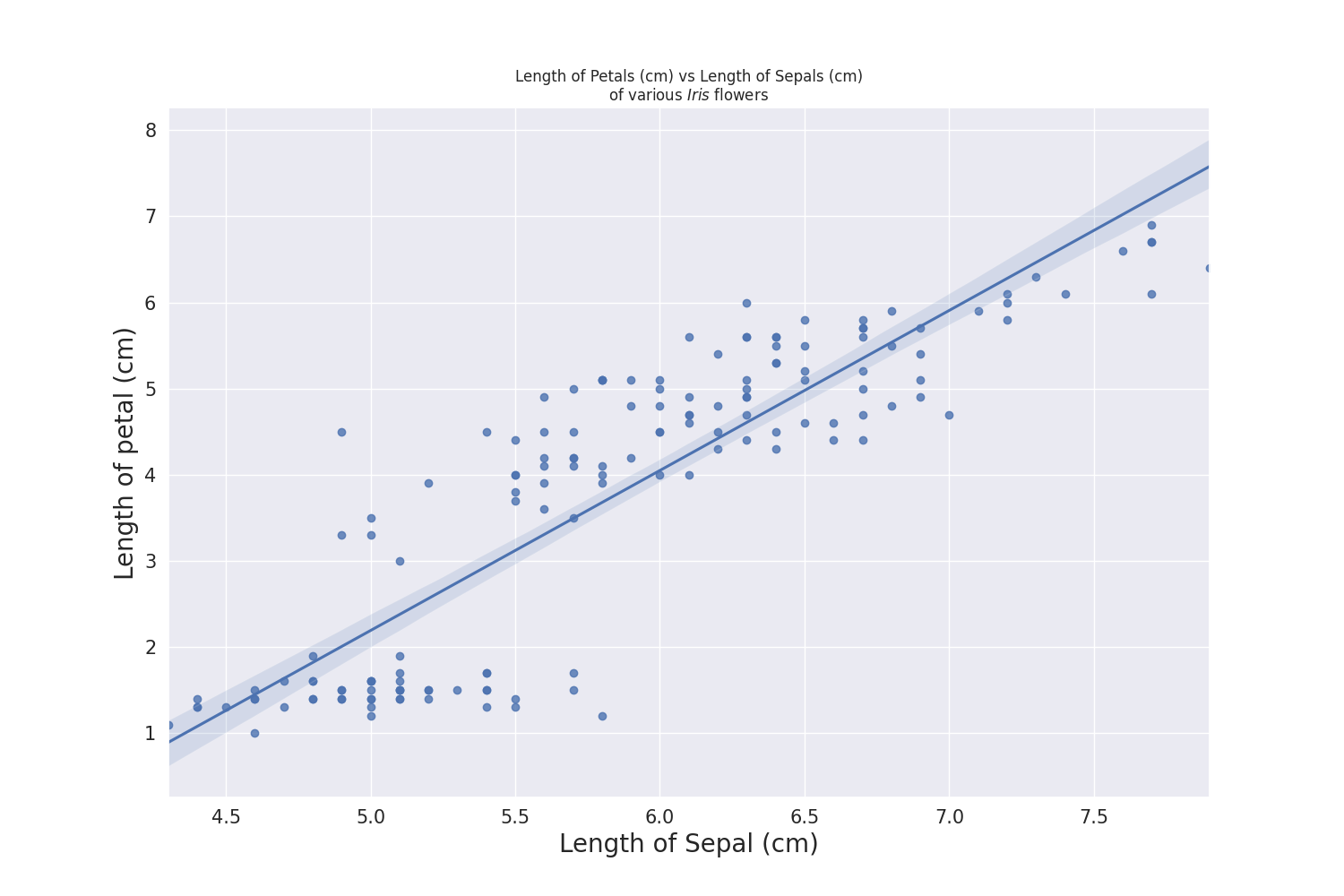
Let us compare with our base graph from earlier to the one we have now!
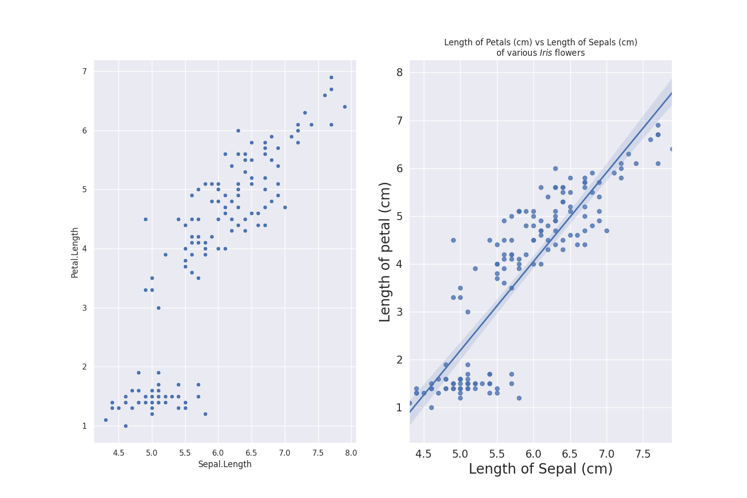
With one look, readers can tell exactly what they are looking at and what message you would want them to takeaway! In this case, as Sepal Length increases, Petal Length increases. This is important, as the use of graphs (and graphics) can greatly assist the audience in learning or understanding the story you want them to take away.
Boxplots
Visualising Categorical Variables
In the previous section, both variables shown are continuous variables, which means they can be any continuous value, like numbers. What if one of the variables is categorical, like Species?
In the sns.pairplot() plot that is provided all the way to the top, you would notice that the Species of Iris has some form of correlation with both Sepal.Length and Petal.Length.
So, if our research question was to investigate the Sepal.Length and Petal.Length (continuous variable) between Species (categorical variables), we simply need to modify some of our code from the previous section to work!
One of the ways to visualise continous variables against categorical variables is to use a boxplot.
For the sake of simplicity of the tutorial, I would not be changing much of the aesthetics such as label size, label names, tile, etc.
#Plotting Petal length vs Species
sns.boxplot(x="Species", y="Petal.Length", data=iris)
sns.boxplot(x="Species", y="Sepal.Length", data=iris)
plt.show()
Plotting 2 boxplots in the same window
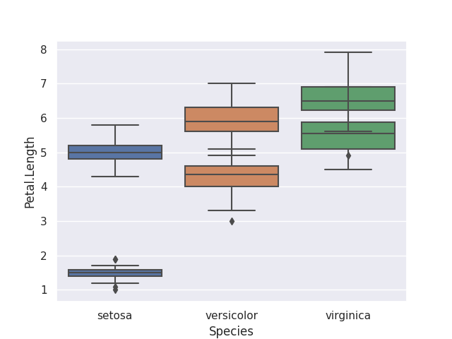
Bummer. The boxplots seemed to have merged together! This requires the use of matplotlib's subplots to handle multiple graphs at the same time.
We are going to use the subplots() function to define our figure size (if needed), and the number of rows and columns we need. Thankfully, boxplot() takes in an argument of ax = as well, allowing us to specify which ax is for which box.
The fig.suptitle() allows us to define the biggest title for these graphs while .set(title='') allows us to define the title for each graph.
#Plotting these two boxplots together in 1 graph
fig, ax = plt.subplots(figsize=(10,12), nrows = 2, ncols = 2) #typically go for a bigger figure size when plotting many graphs together
ax1, ax2, ax3, ax4 = ax.ravel()


fig.suptitle('Length of Petals (cm) vs Species of various $\it{Iris}$ flowers')
sns.boxplot(x="Species", y="Petal.Length", data=iris, ax = ax1).set(title = 'This is ax1')
sns.boxplot(x="Species", y="Sepal.Length", data=iris, ax = ax2).set(title = 'This is ax2')
sns.boxplot(x="Species", y="Petal.Length", data=iris, ax = ax3).set(title = 'This is ax3')
sns.boxplot(x="Species", y="Sepal.Length", data=iris, ax = ax4).set(title = 'This is ax4')
plt.show()
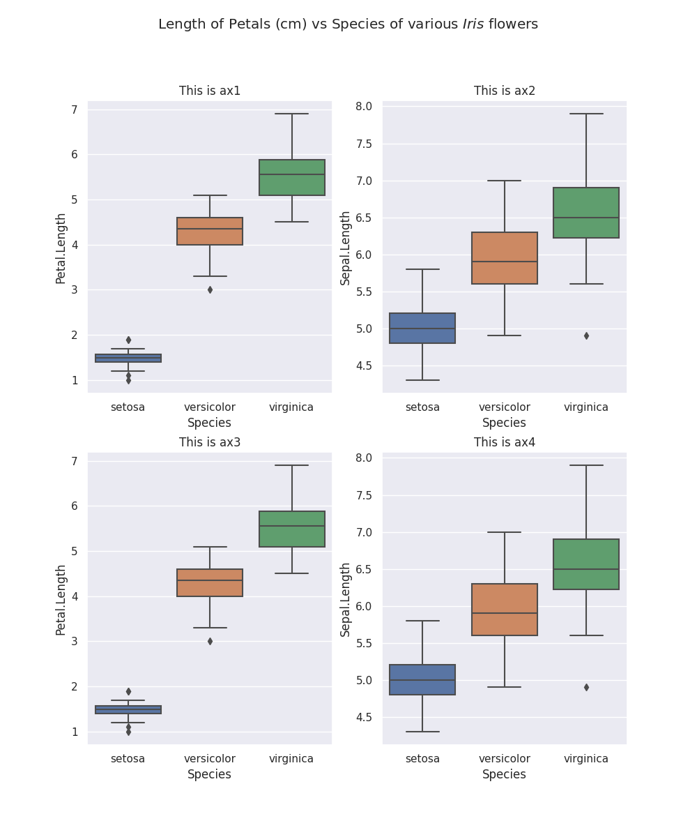
It is clear that there is some form of association between both Sepal.Length and Petal.Length and Species, with I. virginicca having the longest Petal.Length and Sepal.Length and I. Setosa having the shortest.
how do we combine all these information together into a single graph?
Scatterplot: Grouping by Colour
From two sections ago, we could see, on average across all species of Iris flowers, Sepal.Length is positively associated with Petal.Length. However, we have to be careful with this conclusion as it is prone to ecological fallacy. As we are making conclusions on a group and we might conclude this same trend within each species of Iris flowers.
So, you might be asking, how do we visualise this when we only have x- and y-axis on a graph? The secret lies in the COLOR or SHAPE of each data point!
#Grouping
sns.lmplot(x = 'Sepal.Length',y = 'Petal.Length', hue = 'Species', aspect = 1.5, data = iris).set(title='Length of Petals (cm) vs Length of Sepals (cm)\nof various $\it{Iris}$ flowers')
plt.xlabel("Length of Sepal (cm)", fontsize = 20)
plt.ylabel("Length of petal (cm)", fontsize = 20)
plt.show()
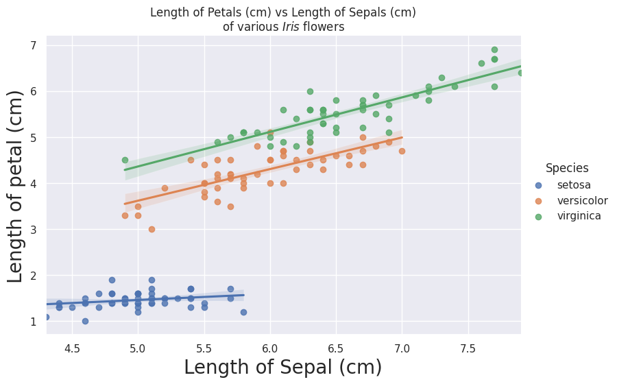
It seems like all three species of Iris are positively associated. With red being I. Setosa, green being I. Versicolor and blue being I. virginica.
We are done! With a quick glance, anyone can immediately understand the following points:
- Each species of Iris flower, the
Petal LengthandSepal Lengthare positively associated - Weak association for I. setosa
- Strong association for I. versicolor and I. virginica
- I. virginica have the longest Petal and Sepal on average as compared to the other three species.
Addtional information
Do note, that there can be TOO MUCH information on a single graph. Generally, representing the data on x- and y- axis and grouping the points accordingly by colour is the maximum I would go for any graph.
If I would want to explore another variable that I have collected, I would generate another graph at that point.
Bad examples of graphs
To illustrate this point, I added another grouping factor of Sepal.Width for colour and shifted Species to shape.
With only a quick glance, you cannot tell much. This example serves to show that "more isn't always better" and that the way the data is presented would aid in the readability of your point.
Now, this is a really exagerrated example of what NOT to do…
Theres just too much text / useless information which could have been in a table and it distracts the reader from the main point of the graph, notwithstanding the overlapping of text affecting readability.
Section 2: Histograms, Barplots and Grouping by Types
In this section, I am going to attempt to visualise data from the birthwt dataset, which was collected at Baystate Medical Center, Springfield, Mass in 1986.
Histograms
Loading in birthwt dataset
There are various ways of loading in the iris dataset in python, but let us load in our own csv file to simulate using our own data, using Pandas.
#I hosted the same dataset exported from R onto my github for easy access
birthwt = pd.read_csv('https://raw.githubusercontent.com/darren1998s/darren1998s.github.io/main/birthwt.csv', index_col=None)
birthwt
| low | age | lwt | race | smoke | ptl | ht | ui | ftv | bwt | |
|---|---|---|---|---|---|---|---|---|---|---|
| 85 | 0 | 19 | 182 | 2 | 0 | 0 | 0 | 1 | 0 | 2523 |
| 86 | 0 | 33 | 155 | 3 | 0 | 0 | 0 | 0 | 3 | 2551 |
| 87 | 0 | 20 | 105 | 1 | 1 | 0 | 0 | 0 | 1 | 2557 |
| 88 | 0 | 21 | 108 | 1 | 1 | 0 | 0 | 1 | 2 | 2594 |
| 89 | 0 | 18 | 107 | 1 | 1 | 0 | 0 | 1 | 0 | 2600 |
| 91 | 0 | 21 | 124 | 3 | 0 | 0 | 0 | 0 | 0 | 2622 |
Optional Information
According to the R documentation, these are what the variables represent:
lowindicator of birth weight less than 2.5 kg.agemother's age in years.lwtmother's weight in pounds at last menstrual period.racemother's race (1 = white, 2 = black, 3 = other).smokesmoking status during pregnancy (0 = not smoking, 1 = smoking).ptlnumber of previous premature labours.hthistory of hypertension.uipresence of uterine irritability.ftvnumber of physician visits during the first trimester.bwtbirth weight in grams.
Solidifying our research question
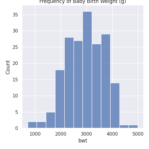
Just like in the previous section, it is important in any experiment that we have a solid question in mind. For the sake of showcasing histograms and grouped barcharts, we can have a basic research question of "Are the birth weight (g) bwt of babies affected by the smoking status of mothers during pregnancy smoke?"
First, a histogram of bwt can be plotted using sns.displot:
#Regular
sns.displot(birthwt, x="bwt").set(title='Frequency of Baby Birth Weight (g)')
plt.show()
In order to split bwt into two categories of smokers smoke = 0 and smoke = 1, the following code can be used:
#Grouped
sns.displot(birthwt, x="bwt",multiple="dodge", col = 'smoke')
plt.tight_layout()
plt.show()
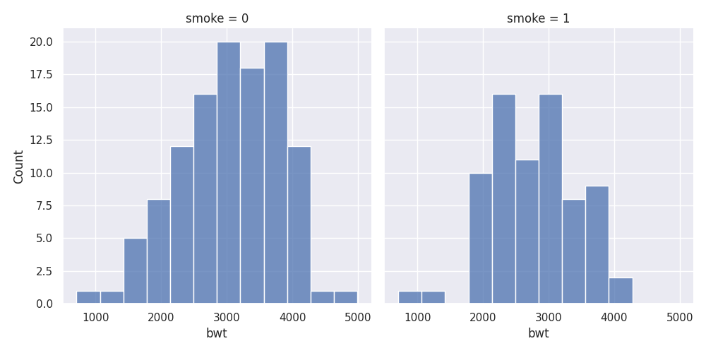
As you can tell, people might not instantly understand what it means by smoke = 0 or smoke = 1, so we would need to change the categories a little bit using pandas.
#Change dataframe easier:
birthwt.loc[birthwt['smoke'] == 0, 'Smoking Status'] = 'No Smoke'
birthwt.loc[birthwt['smoke'] == 1, 'Smoking Status'] = 'Smoke'
birthwt.head()
| low | age | lwt | race | smoke | ptl | ht | ui | ftv | bwt | Smoking Status | |
|---|---|---|---|---|---|---|---|---|---|---|---|
| 85 | 0 | 19 | 182 | 2 | 0 | 0 | 0 | 1 | 0 | 2523 | No Smoke |
| 86 | 0 | 33 | 155 | 3 | 0 | 0 | 0 | 0 | 3 | 2551 | No Smoke |
| 87 | 0 | 20 | 105 | 1 | 1 | 0 | 0 | 0 | 1 | 2557 | Smoke |
| 88 | 0 | 21 | 108 | 1 | 1 | 0 | 0 | 1 | 2 | 2594 | Smoke |
| 89 | 0 | 18 | 107 | 1 | 1 | 0 | 0 | 1 | 0 | 2600 | Smoke |
| 91 | 0 | 21 | 124 | 3 | 0 | 0 | 0 | 0 | 0 | 2622 | No Smoke |
sns.displot(birthwt, x="bwt",multiple="dodge", col = 'Smoking Status')
plt.tight_layout()
plt.show()

Histograms: grouping with colours
What if the comparison of using a grouped histogram is not that obvious? It might be better to put them all in the same axis and use colour to separate the two. In this case, we would need to make some adjustments.
The important thing to take not of here is while calling the sns.displot function. We have the multiple = 'dodge' here so that histogram are not overlapping with each other.
#Colour change
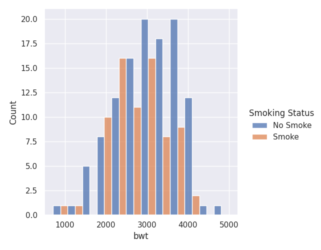
sns.displot(birthwt, x="bwt",multiple="dodge", hue = 'Smoking Status')
plt.show()
Histogram Presentations: Colour Selection / Focusing
In presentations, sometimes you would need to highlight different groups in this histogram, we are going to look at the argument palette to do so!
The palette argument uses a dictionary to help assign colour values to the different groups of data.
#Colour change
sns.displot(birthwt, x="bwt",multiple="dodge", hue = 'Smoking Status', palette={'Smoke': "C0", 'No Smoke':'lightgrey'})
plt.show()
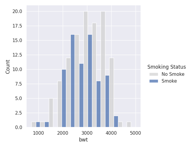
This way, we can highlight just the Non-Smokers!
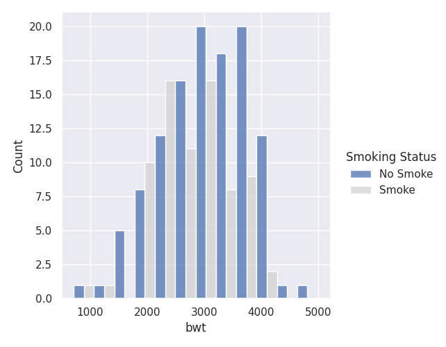
Likewise, if we want to highlight the Smokers, we can change the palette argument like so:
#Colour change
sns.displot(birthwt, x="bwt",multiple="dodge", hue = 'Smoking Status', palette={'No Smoke': "C0", 'Smoke':'lightgrey'})
plt.show()
Grouped Bar Charts
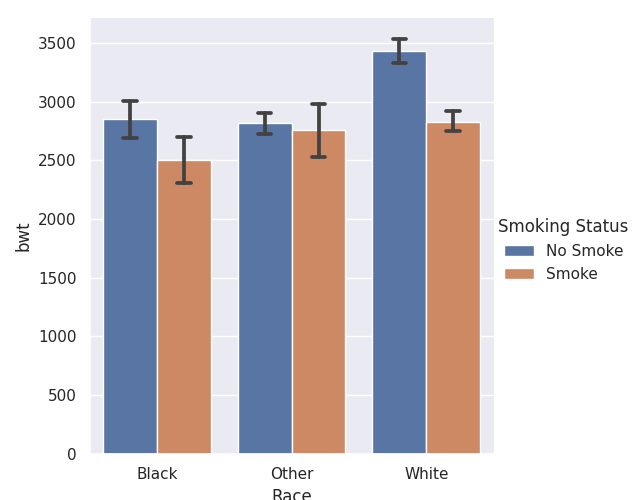
Similarly to Section 1, there is a chance that we fall into an ECOLOGICAL FALLACY. Hence, we would need to group some of our data together. In our tutorial, we are going to group them by race of mothers.
Just like our smoke variable, the race of the mother are also in 1, 2 and 3. We would need to refactor that using pandas like before!
#Factoring Race
birthwt.loc[birthwt['race'] == 1, 'Race'] = 'White'
birthwt.loc[birthwt['race'] == 2, 'Race'] = 'Black'
birthwt.loc[birthwt['race'] == 3, 'Race'] = 'Other'
| low | age | lwt | race | smoke | ptl | ht | ui | ftv | bwt | Smoking Status | Race | |
|---|---|---|---|---|---|---|---|---|---|---|---|---|
| 85 | 0 | 19 | 182 | 2 | 0 | 0 | 0 | 1 | 0 | 2523 | No Smoke | Black |
| 86 | 0 | 33 | 155 | 3 | 0 | 0 | 0 | 0 | 3 | 2551 | No Smoke | Other |
| 87 | 0 | 20 | 105 | 1 | 1 | 0 | 0 | 0 | 1 | 2557 | Smoke | White |
| 88 | 0 | 21 | 108 | 1 | 1 | 0 | 0 | 1 | 2 | 2594 | Smoke | White |
| 89 | 0 | 18 | 107 | 1 | 1 | 0 | 0 | 1 | 0 | 2600 | Smoke | White |
| 91 | 0 | 21 | 124 | 3 | 0 | 0 | 0 | 0 | 0 | 2622 | No Smoke | Other |
The function catplot() will be used to create categorical plots, kind argument will make seaborn plot a barchart. In order to get errorbars, the argument ci can be specified. ci stands for confidence intervals and the default argument is around 1.96 standard deviations. By specifying ci = 68, the errorbar now shows roughly around 1 standard error around the mean.
sns.catplot(x="Race", y="bwt", hue="Smoking Status", kind="bar", ci = 68, capsize=.1, data=birthwt)
plt.show()