Giving meaning
Adding labels to the graph
With our generated graphs from the previous section, having different colours, marker sizes and line styles are good. However, these graphs mean nothing without their appropriate labels.
These labels include (not exhaustive):
- Graph label
- x,y labels
- Title label
- Legends
- Error bars
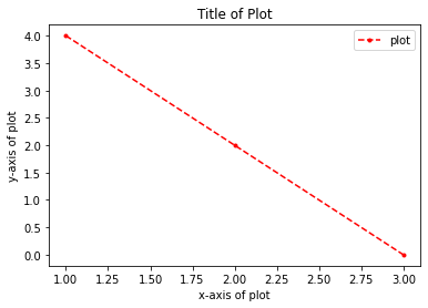
Firstly, we can label the plot in the plt.plot() function by using the argument label = ''. In our example, label = plot would mean that we literally named our lineplot ‘plot'.
We can then add labels to x-axis, y-axis and the title using plt.xlabel(), plt.ylabel() and plt.title() function respectively. We can then finally use plt.legend(), to display the legend which shows the name of our lineplot ‘plot'.
x = [1,2,3]
y = [4,2,0]

plt.plot(x, y, marker = '.', linestyle = 'dashed', color = 'r', label = 'plot')

# Setting Labels
plt.xlabel('x-axis of plot')
plt.ylabel('y-axis of plot')
plt.title('Title of Plot')
plt.legend()
plt.show()
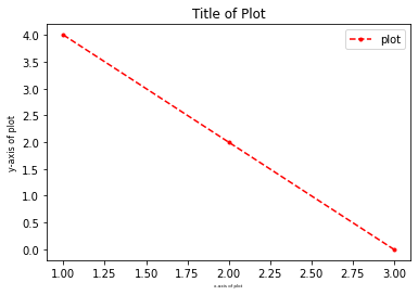
Exploring different sized Labels
Sometimes, the size of the labels might be too big or too small. This is not a problem as we can easily change the size of these labels using fontsize argument while setting each label!
x = [1,2,3]
y = [4,2,0]

plt.plot(x, y, marker = '.', linestyle = 'dashed', color = 'r', label = 'plot')

# Setting Labels & Fontsize using fontsize =
plt.xlabel('x-axis of plot', fontsize = 4)
plt.ylabel('y-axis of plot', fontsize = 8)
plt.title('Title of Plot', fontsize = 12)
plt.legend()
plt.show()
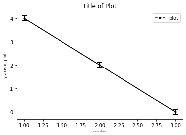
Adding Error bars
In this section, we would explore adding error bars for the plot to showcase the range of error presented in the graph. One would have to make the connection between points transparent by making the errorbar plot linestyle blank as seen in the code.
Let's say you have a dataset and you would like to add error bars to each point. Luckily for you, the function plt.errorbar() exists! This function takes in your x and y values as positions for each point.
The argument yerr allows you to specify the error (the +- value from your point that you want). For our example, we assume at each point, the yerr is +- 0.1.
The other arguments such as capsize, elinewidth and markeredgewith are for the errorbars' aesthetic looks and are trivial and left as an exercise to the reader.
x = [1,2,3]
y = [4,2,0]
y_error = 0.1

plt.plot(x, y, marker = '.', linestyle = 'dashed', color = 'k', label = 'plot')

# Errorbar
plt.errorbar(x, y, yerr = y_error, color = 'k', capsize = 5, elinewidth = 2, markeredgewidth = 2)

# Setting Labels & Fontsize using fontsize =
plt.xlabel('x-axis of plot', fontsize = 4)
plt.ylabel('y-axis of plot', fontsize = 8)
plt.title('Title of Plot', fontsize = 12)
plt.legend()
plt.show()