Misrepresentations of COVID19 Data (and how to fix them)
Kansas 7-Day Rolling Average of Daily Cases
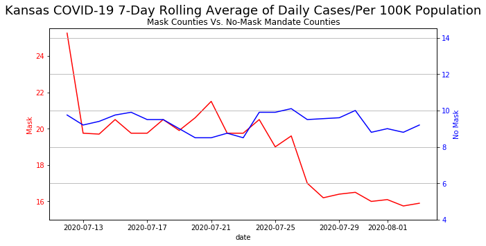
On August 6, 2020, the following image  created by Kansas Department of Health and Environment to show daily cases of COVID19 in Kansas (Engledowl & Weiland, 2021).
At first glance, there seems to be nothing wrong with this graph / plot. It is just a regular plot showing wearing masks will result in a significant decline in COVID19 cases over three weeks as compared to states with no mandatory mask mandates.
However, on closer inspection, the y-axis for both graphs are not the same! The minimum cases for states with mask mandates is "15" while the highest number of cases for states with no mask mandate is around "10". This tells us that states with mask mandates actually has higher cases of COVID19!
Even though there is nothing technically wrong with showing this graph, it is extremely misleading as the message this graph was trying to show is that wearing masks would result in a lower number of cases, rather than mask wearing causing a decline of COVID19 cases!
Before we go about fixing the graph, we can recreate this "bad graph" in python! We are not going to go through what each line means, so feel free to skip to the next cell
# import relevant packages
import pandas as pd
import matplotlib.pyplot as plt

# init the numbers by hardcoding, (it is not publicly available so...)
No_mask = [9.75, 9.2, 9.4, 9.75, 9.9, 9.5, 9.5, 9, 8.5, 8.5, 8.75, 8.5, 9.9, 9.9, 10.1, 9.5, 9.55, 9.6, 10, 8.8, 9, 8.8, 9.2]
mask = [25.25, 19.75, 19.7, 20.5, 19.75,19.75, 20.5, 19.9,20.6,21.5,19.75,19.75, 20.5, 19,19.6,17,16.2, 16.4, 16.5, 16,16.1,15.75,15.9]

# Generate the same dates using pandas
date = pd.date_range(start="2020-07-12",end="2020-08-03")

# Initiate a subplot because we know we want two axis
fig, ax1 = plt.subplots(figsize = (9,5))

# This converter is here to allow for matplotlib to convert the date properly
pd.plotting.register_matplotlib_converters()

# Plotting the Mask Mandates first
color = 'red'
ax1.plot(date, mask, color=color)
ax1.set_xlabel('date')
ax1.set_ylabel('Mask', color=color)
ax1.tick_params(axis='y', labelcolor=color) # This colours the axis too!

ax2 = ax1.twinx()  # Create a new Axes object which uses the same x-axis as ax1

color = 'blue'
ax2.plot(date, No_mask, color=color)
ax2.set_ylabel('No Mask', color=color)  # x-label is already defined above so we just do y-label here
ax2.tick_params(axis='y', labelcolor=color) # This colours the axis too!


ax1.set_ylim(15,25.5) # setting individual ylims
ax2.set_ylim(4,14.5) # for both axis so we get the "misrepresentation"

plt.suptitle('Kansas COVID-19 7-Day Rolling Average of Daily Cases/Per 100K Population', fontsize = 18)
plt.title('\nMask Counties Vs. No-Mask Mandate Counties')
fig.tight_layout()  # makes everything nice and uncropped
plt.grid()
plt.show()
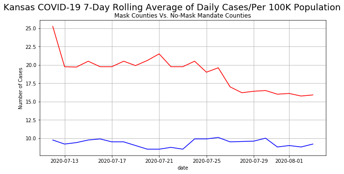
We have now generated "misrepresented graph". Now lets fix this. This is a very simple fix! Just plot the same numbers on the same Axes object like we have been doing previously!
import pandas as pd
import matplotlib.pyplot as plt

# init the numbers by hardcoding, (it is not publicly available so...)
No_mask = [9.75, 9.2, 9.4, 9.75, 9.9, 9.5, 9.5, 9, 8.5, 8.5, 8.75, 8.5, 9.9, 9.9, 10.1, 9.5, 9.55, 9.6, 10, 8.8, 9, 8.8, 9.2]
mask = [25.25, 19.75, 19.7, 20.5, 19.75,19.75, 20.5, 19.9,20.6,21.5,19.75,19.75, 20.5, 19,19.6,17,16.2, 16.4, 16.5, 16,16.1,15.75,15.9]

# Generate the same dates using pandas
date = pd.date_range(start="2020-07-12",end="2020-08-03")

# There is actually no need to create an Axes object, but I want to show what changed
# hence I did it.
fig, ax1 = plt.subplots(figsize = (9,5))

# This converter is here to allow for matplotlib to convert the date properly
pd.plotting.register_matplotlib_converters()

##################################################################
# This is start of the part that changed when you refer to above #
##################################################################
# Plotting the numbers using ax1 object
ax1.plot(date, mask, label = 'With mask', color = 'red')
ax1.plot(date, No_mask, label = 'Without mask', color = 'blue')

# Setting the labels
ax1.set_xlabel('date')
ax1.set_ylabel('Number of Cases')
ax1.tick_params(axis='y')
################################################################
# This is end of the part that changed when you refer to above #
################################################################

plt.suptitle('Kansas COVID-19 7-Day Rolling Average of Daily Cases/Per 100K Population', fontsize = 18)
plt.title('\nMask Counties Vs. No-Mask Mandate Counties')
fig.tight_layout()  # makes everything nice and uncropped
plt.grid()
plt.show()
Georgia Department of Public Health
Georgia Department of Public Health posted this graph sometime in May 2020. 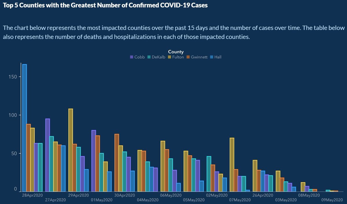
This plot was criticised on the basis that it was borderline data manipulation. At first glance, this bar chart shows that COVID19 cases in the top five counties in the state were dropping over time.
BUT on closer inspection of the x-axis shows that the dates were not in chronological order?! 28th April was shown first before 27th April?
This example of a misleading use of statistics is perhaps one of the more clear cases of intent to mislead, despite attempts of the administration to make it appear accidental - Engledowl & Weiland, 2021
For reasons that it is way too much work for everyone to recreate this misleading barchart in Python, we are going to jump straight into "fixing" this graph.
- First we are going to grab a separate dataset from our favorite github link
- Then we are going to subset it to just in Georgia
US_link = 'https://raw.githubusercontent.com/CSSEGISandData/COVID-19/master/csse_covid_19_data/csse_covid_19_time_series/time_series_covid19_confirmed_US.csv'
covid19_US_data = pd.read_csv(US_link)
georgia_df = covid19_US_data.loc[covid19_US_data['Province_State'] == 'Georgia']
georgia_df.head()
| UID | iso2 | iso3 | code3 | FIPS | Admin2 | Province_State | Country_Region | Lat | Long_ | ... | 7/28/21 | 7/29/21 | 7/30/21 | 7/31/21 | 8/1/21 | 8/2/21 | 8/3/21 | 8/4/21 | 8/5/21 | 8/6/21 | |
|---|---|---|---|---|---|---|---|---|---|---|---|---|---|---|---|---|---|---|---|---|---|
| 411 | 84013001 | US | USA | 840 | 13001.0 | Appling | Georgia | US | 31.748472 | -82.289091 | ... | 2417 | 2428 | 2435 | 2435 | 2435 | 2449 | 2464 | 2480 | 2489 | 2500 |
| 412 | 84013003 | US | USA | 840 | 13003.0 | Atkinson | Georgia | US | 31.296335 | -82.875459 | ... | 1101 | 1105 | 1114 | 1114 | 1114 | 1121 | 1127 | 1131 | 1139 | 1146 |
| 413 | 84013005 | US | USA | 840 | 13005.0 | Bacon | Georgia | US | 31.554565 | -82.459365 | ... | 1738 | 1745 | 1756 | 1756 | 1756 | 1764 | 1777 | 1785 | 1799 | 1810 |
| 414 | 84013007 | US | USA | 840 | 13007.0 | Baker | Georgia | US | 31.326699 | -84.442188 | ... | 268 | 267 | 267 | 267 | 267 | 272 | 274 | 277 | 279 | 280 |
| 415 | 84013009 | US | USA | 840 | 13009.0 | Baldwin | Georgia | US | 33.068823 | -83.247017 | ... | 4644 | 4652 | 4662 | 4662 | 4662 | 4680 | 4696 | 4712 | 4729 | 4742 |
5 rows × 574 columns
-
We would then need to subset the
georgia_dfto contain only the countiesHall, Cobb, Fulton, Gwinnett, DeKalb. This can be done using the.isincommand we used in the previous sections! -
Since we know how to plot with dates as our rows, we would need to transpose the dataframe using
.T(like we did in the previous sections)!
# Subsetting our dataset further to include the counties we want using .isin
georgia_df_filter = georgia_df[georgia_df['Admin2'].isin(['Hall', 'Cobb', 'Fulton','Gwinnett','DeKalb'])]

df_t = georgia_df_filter.T
df_t.head(6)
| 443 | 453 | 470 | 477 | 479 | |
|---|---|---|---|---|---|
| UID | 84013067 | 84013089 | 84013121 | 84013135 | 84013139 |
| iso2 | US | US | US | US | US |
| iso3 | USA | USA | USA | USA | USA |
| code3 | 840 | 840 | 840 | 840 | 840 |
| FIPS | 13067 | 13089 | 13121 | 13135 | 13139 |
| Admin2 | Cobb | DeKalb | Fulton | Gwinnett | Hall |
Since we want our column names to be something more recognisable like the county names, we would need to do the following:
-
We need to set the row
Admin2as the column name. This can be done using.loc. -
We then need to subset our dates to the ones shown in the graph. This can also be done using
.loc.
#Changing the column name
df_t.columns = [df_t.loc['Admin2']]

df_t_date = df_t.loc['4/26/20':'5/9/20']

# 26 April to 9 May 2020


df_t_date.head()
| Admin2 | Cobb | DeKalb | Fulton | Gwinnett | Hall |
|---|---|---|---|---|---|
| 4/26/20 | 1428 | 1800 | 2545 | 1504 | 1033 |
| 4/27/20 | 1483 | 1855 | 2680 | 1545 | 1098 |
| 4/28/20 | 1515 | 1887 | 2727 | 1603 | 1183 |
| 4/29/20 | 1571 | 1970 | 2770 | 1720 | 1242 |
| 4/30/20 | 1614 | 2026 | 2811 | 1787 | 1332 |
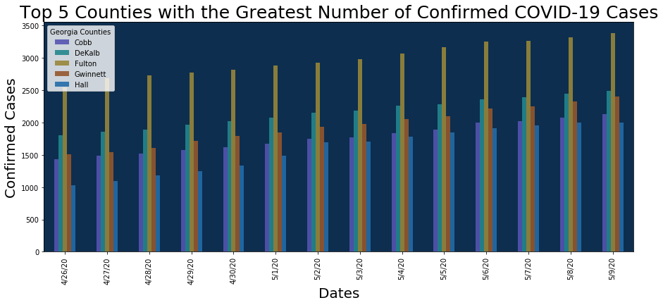
Then we can just plot this like a regular dataframe!
# You can specify the colour using the color argument, alpha is the transparency of the graph
ax = df_t_date.plot.bar(figsize=(15, 6), color=['#5553B1', '#23878E', '#988739','#95572C', '#236CA9'], alpha = 0.9)

# This sets the background colour of the graph
ax.set_facecolor('#0D2E4F')

# Redo the legend so it looks nicer
ax.legend(["Cobb", "DeKalb", "Fulton", "Gwinnett", "Hall"], title = 'Georgia Counties')
ax.set_ylabel('Confirmed Cases', fontsize = 20)
ax.set_xlabel('Dates', fontsize = 20)
ax.set_title('Top 5 Counties with the Greatest Number of Confirmed COVID-19 Cases', fontsize = 25)
plt.show()
References:
Bullshit, C. (2020, May 17). One of the most misleading graphs we have ever Seen. The Georgia Department of public health has ordered the dates on the x axis not chronologically, but rather to create the impression of a decreasing number of cases over time. Twitter. https://twitter.com/callin_bull/status/1261855753846927360?lang=en.
Engledowl, C., & Weiland, T. (2021). Data (mis)representation and COVID-19: Leveraging misleading data visualizations for Developing statistical Literacy Across Grades 6–16. Journal of Statistics and Data Science Education, 1–5. https://doi.org/10.1080/26939169.2021.1915215