Boxplots and Scatter matrix
Boxplot
First, customary importing of packages and data if you haven't already done so from the previous sections.
import pandas as pd
import matplotlib.pyplot as plt

df = pd.read_csv("https://raw.githubusercontent.com/darren1998s/darren1998s.github.io/main/iris.csv")
Using the a slightly altered syntax as the bar chart and histogram from the previous sections, we can easily plot boxplots.
For our example, we are going to plot Petal.Length grouping by Species.
#How to plot histogram
#df['Petal.Length'].plot(kind='hist')

#Plotting boxplot
ax = df.boxplot('Petal.Length', by='Species')

#Housekeeping to make the graph looks comprehensible#
ax.set_title("")
ax.set_ylabel('Petal Length')
plt.show()
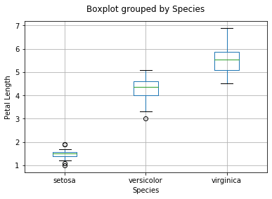
From this boxplot, we can instantly tell a few things:
-
The variance in both I. versicolor and I. virginica are lesser than that in I. setosa.
-
I. setosa has the smallest Petal Length and I. viriginica has the largest petals.
-
There are more ‘outlier' data (based on the 1.5*IQR rule) found in I. setosa as compared to the other species of Iris flowers.
Scatter matrix
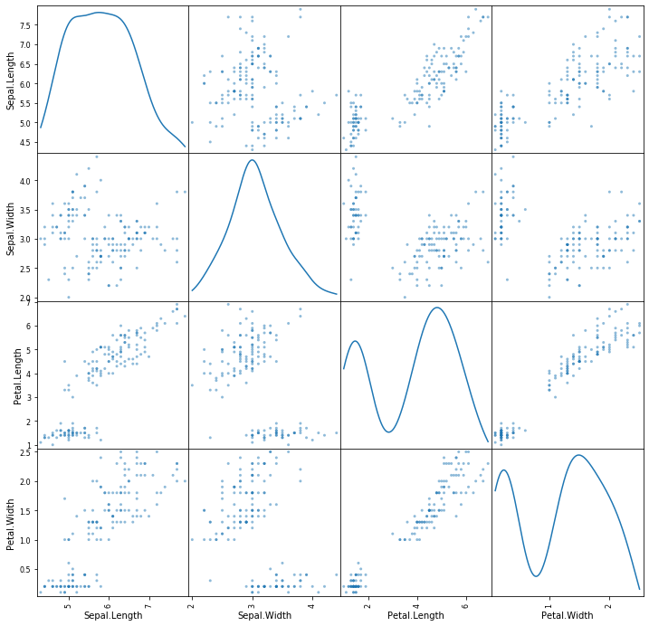
It is entirely possible that given a dataset, there can be many permutations of variables to plot. By utilising a scatter_matrix, pandas handily plots all variables against other variables!
This way in 1 shot, you could see which plots have any ‘interesting' data.
1 thing to note is that, diagonal='kde' plots a density plot, of that particular variable.
pd.plotting.scatter_matrix(df,diagonal='kde', figsize=(12,12))
plt.show()