Exploration of COVID19 dataset: Time-Series plots
Recap & Grabbing Time-Series Data
First, customary importing of packages and data if you haven't already done so from the previous sections.
import pandas as pd
import matplotlib.pyplot as plt
ASEAN_countries_list = ['Brunei', 'Cambodia', 'Indonesia', 'Laos', 'Malaysia', 'Burma', 'Philippines', 'Singapore', 'Vietnam']
In order for us to do time-series plots of COVID19, it would be very inefficient of us to use datasets where a single file is data for 1 day. Luckily for us, from the same source, there is a collated dataset that has a column for each day. Let's load it in the same way first.
We can also use the same code from previous sections to select for ASEAN countries only!
link = 'https://raw.githubusercontent.com/CSSEGISandData/COVID-19/master/csse_covid_19_data/csse_covid_19_time_series/time_series_covid19_confirmed_global.csv'
covid19_data = pd.read_csv(link)
asean_df = covid19_data[covid19_data['Country/Region'].isin(ASEAN_countries_list)]
asean_df.set_index('Country/Region', inplace = True)
asean_df_dropped = asean_df.drop(columns = ['Province/State', 'Lat', 'Long'])
asean_df_dropped
| 1/22/20 | 1/23/20 | 1/24/20 | 1/25/20 | 1/26/20 | 1/27/20 | 1/28/20 | 1/29/20 | 1/30/20 | 1/31/20 | ... | 7/25/21 | 7/26/21 | 7/27/21 | 7/28/21 | 7/29/21 | 7/30/21 | 7/31/21 | 8/1/21 | 8/2/21 | 8/3/21 | |
|---|---|---|---|---|---|---|---|---|---|---|---|---|---|---|---|---|---|---|---|---|---|
| Country/Region | |||||||||||||||||||||
| Brunei | 0 | 0 | 0 | 0 | 0 | 0 | 0 | 0 | 0 | 0 | ... | 321 | 333 | 333 | 333 | 333 | 336 | 337 | 337 | 338 | 338 |
| Burma | 0 | 0 | 0 | 0 | 0 | 0 | 0 | 0 | 0 | 0 | ... | 269525 | 274155 | 279119 | 284099 | 289333 | 294460 | 299185 | 302665 | 306354 | 311067 |
| Cambodia | 0 | 0 | 0 | 0 | 0 | 1 | 1 | 1 | 1 | 1 | ... | 72923 | 73701 | 74386 | 75152 | 75917 | 76585 | 77243 | 77914 | 78474 | 79051 |
| Indonesia | 0 | 0 | 0 | 0 | 0 | 0 | 0 | 0 | 0 | 0 | ... | 3166505 | 3194733 | 3239936 | 3287727 | 3331206 | 3372374 | 3409658 | 3440396 | 3462800 | 3496700 |
| Laos | 0 | 0 | 0 | 0 | 0 | 0 | 0 | 0 | 0 | 0 | ... | 4762 | 4985 | 5154 | 5434 | 5675 | 5919 | 6299 | 6566 | 6765 | 7015 |
| Malaysia | 0 | 0 | 0 | 3 | 4 | 4 | 4 | 7 | 8 | 8 | ... | 1013438 | 1027954 | 1044071 | 1061476 | 1078646 | 1095486 | 1113272 | 1130422 | 1146186 | 1163291 |
| Philippines | 0 | 0 | 0 | 0 | 0 | 0 | 0 | 0 | 1 | 1 | ... | 1548755 | 1555396 | 1562420 | 1566667 | 1572287 | 1580824 | 1588965 | 1597689 | 1605762 | 1612541 |
| Singapore | 0 | 1 | 3 | 3 | 4 | 5 | 7 | 7 | 10 | 13 | ... | 64179 | 64314 | 64453 | 64589 | 64722 | 64861 | 64981 | 65102 | 65213 | 65315 |
| Vietnam | 0 | 2 | 2 | 2 | 2 | 2 | 2 | 2 | 2 | 2 | ... | 101173 | 106347 | 117121 | 123640 | 133405 | 141122 | 150060 | 157507 | 157507 | 174461 |
9 rows × 560 columns
Transposing
From the table, the columns are the dates, and the countries were set as the index. This would be very difficult for us to plot a time-series graph with the dates as the x-axis.
To solve this problem, we would need to transpose the dataframe so that the columns are rows.
asean_t = asean_df_dropped.T
asean_t
| Country/Region | Brunei | Burma | Cambodia | Indonesia | Laos | Malaysia | Philippines | Singapore | Vietnam |
|---|---|---|---|---|---|---|---|---|---|
| 1/22/20 | 0 | 0 | 0 | 0 | 0 | 0 | 0 | 0 | 0 |
| 1/23/20 | 0 | 0 | 0 | 0 | 0 | 0 | 0 | 1 | 2 |
| 1/24/20 | 0 | 0 | 0 | 0 | 0 | 0 | 0 | 3 | 2 |
| 1/25/20 | 0 | 0 | 0 | 0 | 0 | 3 | 0 | 3 | 2 |
| 1/26/20 | 0 | 0 | 0 | 0 | 0 | 4 | 0 | 4 | 2 |
| ... | ... | ... | ... | ... | ... | ... | ... | ... | ... |
| 7/30/21 | 336 | 294460 | 76585 | 3372374 | 5919 | 1095486 | 1580824 | 64861 | 141122 |
| 7/31/21 | 337 | 299185 | 77243 | 3409658 | 6299 | 1113272 | 1588965 | 64981 | 150060 |
| 8/1/21 | 337 | 302665 | 77914 | 3440396 | 6566 | 1130422 | 1597689 | 65102 | 157507 |
| 8/2/21 | 338 | 306354 | 78474 | 3462800 | 6765 | 1146186 | 1605762 | 65213 | 157507 |
| 8/3/21 | 338 | 311067 | 79051 | 3496700 | 7015 | 1163291 | 1612541 | 65315 | 174461 |
560 rows × 9 columns
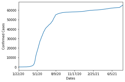
Time-Series Plotting
To plot a time-series chart, it is really easy with pandas!
ax = asean_t['Singapore'].plot()
ax.set_ylabel('Confirmed Cases')
ax.set_xlabel('Dates')
plt.show()
In order to plot more countries onto the same plot, we would need to make use of the plt.subplots() function call as shown in the matplotlib section previously!
fig, ax = plt.subplots()

#Iterate through our countries so we can plot automatically plot them!
for country in ASEAN_countries_list:
    asean_t[country].plot(ax=ax)

ax.set_ylabel('Confirmed Cases')
ax.set_xlabel('Dates')
ax.legend()
plt.show()
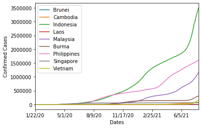
From the time-series plots, we can tell that currently, Indonesia has the highest cumulative confirmed cases amongst all the ASEAN countries!