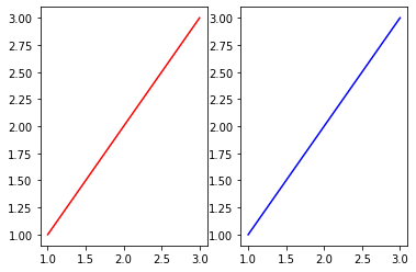
Subplots
Second graph generation
From the previous sections, you saw that calling plt.plot() twice only results on two graphs on the same axis. What if we are plotting different variables which cannot be plotted on the same axis?
The solution now comes in the form of plt.subplots(). In this function, we can specify how many rows and columns we want in this figure using nrows and ncols respectively. In our example, we are going to use 1 row and 2 columns.
The plotting of these two graphs are very similar. Just take note that instead of plt.plot(), we would be using ax[].plot instead. In our example, ax[0] would mean plotting on the first Axes of the subplot, and ax[1] would mean plotting on the second Axes of the subplot.
x = [1,2,3]
y = [1,2,3]
z = [1,2,3]

fig, ax = plt.subplots(nrows = 1, ncols = 2)
ax[0].plot(x, y, label = 'first plot', color = 'r')
ax[1].plot(x, z, label = 'second plot', color = 'b')
plt.show()
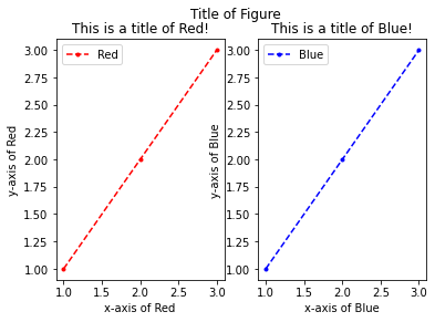
Title and label generation
In a single plot, plt.xlabel(),plt.ylabel() and plt.title() are used to generate labels for the x-axis, y-axis and title respectively.
However, it is slightly different when generating these labels for subplots! They are now ax[].set_xlabel(), ax[].set_ylabel() and ax[].set_title(). Where you can set each plot's individual labels.
Additionally,we would be able to include the final title of all graphs here using plt.suptitle() (also known as a super title).
x = [1,2,3]
y = [1,2,3]
z = [1,2,3]

fig, ax = plt.subplots(nrows = 1, ncols = 2)

# ax[0] plotting and labelling
ax[0].plot(x, y, marker = '.', linestyle = 'dashed', color = 'r', label = 'Red')
ax[0].set_xlabel('x-axis of Red')
ax[0].set_ylabel('y-axis of Red')
ax[0].set_title('This is a title of Red!')
ax[0].legend()

# ax[1] plotting and labelling
ax[1].plot(x, z, marker = '.', linestyle = 'dashed', color = 'b', label = 'Blue')
ax[1].set_xlabel('x-axis of Blue')
ax[1].set_ylabel('y-axis of Blue')
ax[1].set_title('This is a title of Blue!')
ax[1].legend()

# Global plt
plt.suptitle('Title of Figure')
plt.show()
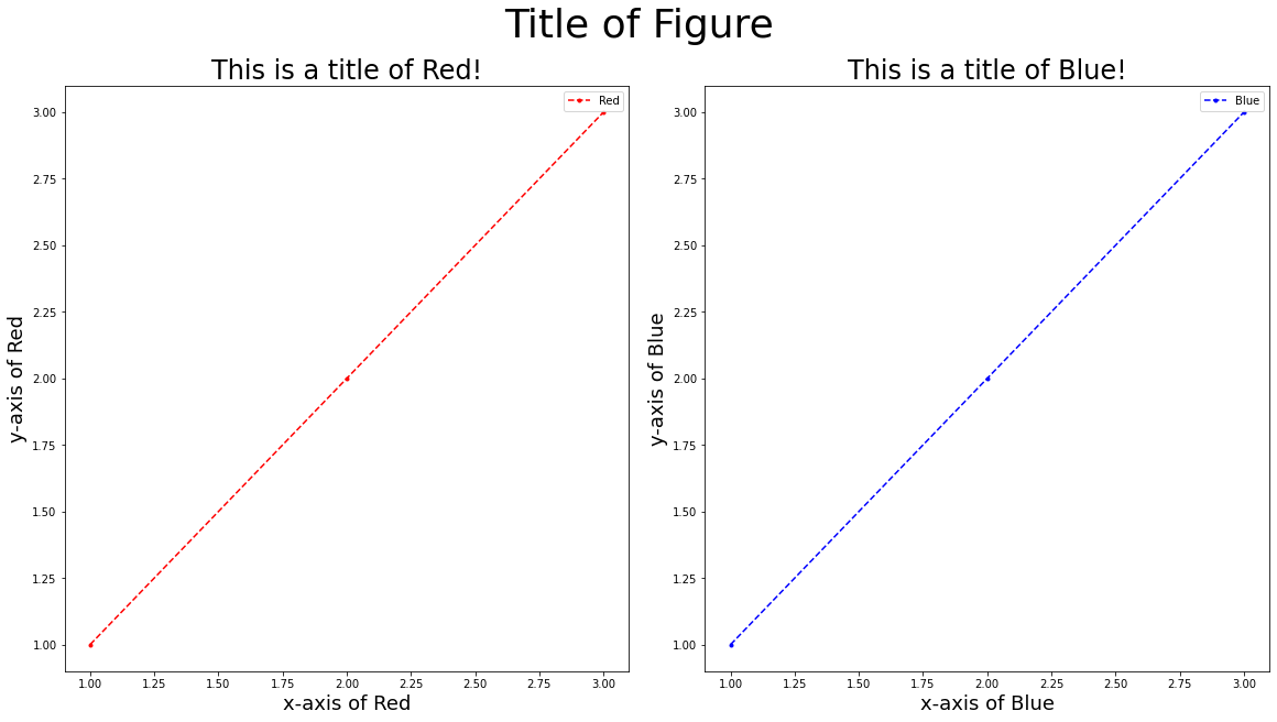
Additional formatting
As seen from the previous graph, the formatting of the space between figures requires some fixing. For example, ‘y-axis of Blue' clipped into the other graph!
The argument constrained_layout could be used in the plt.subplots() function to fix this issue. Additionally, we can increase the size of the figure using figsize as an argument as well!
Do take note that while increasing the figure size, the fontsize of some labels would need to be changed as well!
x = [1,2,3]
y = [1,2,3]
z = [1,2,3]

fig, ax = plt.subplots(nrows = 1, ncols = 2, constrained_layout = True, figsize = (16, 9))

# ax[0] plotting and labelling
ax[0].plot(x, y, marker = '.', linestyle = 'dashed', color = 'r', label = 'Red')
ax[0].set_xlabel('x-axis of Red', fontsize = 18)
ax[0].set_ylabel('y-axis of Red', fontsize = 18)
ax[0].set_title('This is a title of Red!', fontsize = 24)
ax[0].legend()

# ax[1] plotting and labelling
ax[1].plot(x, z, marker = '.', linestyle = 'dashed', color = 'b', label = 'Blue')
ax[1].set_xlabel('x-axis of Blue', fontsize = 18)
ax[1].set_ylabel('y-axis of Blue', fontsize = 18)
ax[1].set_title('This is a title of Blue!', fontsize = 24)
ax[1].legend()

# Global plt
plt.suptitle('Title of Figure', fontsize = 36)
plt.show()