Exploration of COVID19 dataset: Effectiveness of Measures against COVID19
Importing everything from the previous part
First, customary importing of packages and data if you haven't already done so from the previous sections.
I also imported the exact same code as from the previous section to speed up the tutorial.
import pandas as pd
import matplotlib.pyplot as plt
ASEAN_countries_list = ['Brunei', 'Cambodia', 'Indonesia', 'Laos', 'Malaysia', 'Burma', 'Philippines', 'Singapore', 'Vietnam']

link = 'https://raw.githubusercontent.com/CSSEGISandData/COVID-19/master/csse_covid_19_data/csse_covid_19_time_series/time_series_covid19_confirmed_global.csv'
covid19_data = pd.read_csv(link)
asean_df = covid19_data[covid19_data['Country/Region'].isin(ASEAN_countries_list)]
asean_df.set_index('Country/Region', inplace = True)
asean_df_dropped = asean_df.drop(columns = ['Province/State', 'Lat', 'Long'])
asean_t = asean_df_dropped.T

def country_diff(df, country):
    df_s = df[country].copy()
    df_s_F = df_s.shift(1)
    country_df = pd.concat([df_s, df_s_F], axis=1)
    country_df.columns = [f'{country}_Cases_O', f'{country}_Cases_ShiftF']
    country_df[f'{country}_difference'] = country_df[f'{country}_Cases_O'] - country_df[f'{country}_Cases_ShiftF']
    return country_df

asean_daily_df = pd.DataFrame()
for country in ASEAN_countries_list:
    temp_df = country_diff(asean_t, country)
    asean_daily_df = pd.concat([asean_daily_df, temp_df[f'{country}_difference']],sort = False, axis = 1)
asean_daily_df = asean_daily_df.iloc[1:,]
asean_daily_df
| Brunei_difference | Cambodia_difference | Indonesia_difference | Laos_difference | Malaysia_difference | Burma_difference | Philippines_difference | Singapore_difference | Vietnam_difference | |
|---|---|---|---|---|---|---|---|---|---|
| 1/23/20 | 0.0 | 0.0 | 0.0 | 0.0 | 0.0 | 0.0 | 0.0 | 1.0 | 2.0 |
| 1/24/20 | 0.0 | 0.0 | 0.0 | 0.0 | 0.0 | 0.0 | 0.0 | 2.0 | 0.0 |
| 1/25/20 | 0.0 | 0.0 | 0.0 | 0.0 | 3.0 | 0.0 | 0.0 | 0.0 | 0.0 |
| 1/26/20 | 0.0 | 0.0 | 0.0 | 0.0 | 1.0 | 0.0 | 0.0 | 1.0 | 0.0 |
| 1/27/20 | 0.0 | 1.0 | 0.0 | 0.0 | 0.0 | 0.0 | 0.0 | 1.0 | 0.0 |
| ... | ... | ... | ... | ... | ... | ... | ... | ... | ... |
| 7/31/21 | 1.0 | 658.0 | 37284.0 | 380.0 | 17786.0 | 4725.0 | 8141.0 | 120.0 | 8938.0 |
| 8/1/21 | 0.0 | 671.0 | 30738.0 | 267.0 | 17150.0 | 3480.0 | 8724.0 | 121.0 | 7447.0 |
| 8/2/21 | 1.0 | 560.0 | 22404.0 | 199.0 | 15764.0 | 3689.0 | 8073.0 | 111.0 | 0.0 |
| 8/3/21 | 0.0 | 577.0 | 33900.0 | 250.0 | 17105.0 | 4713.0 | 6779.0 | 102.0 | 16954.0 |
| 8/4/21 | 0.0 | 583.0 | 35867.0 | 290.0 | 19819.0 | 4051.0 | 7283.0 | 95.0 | 7295.0 |
560 rows × 9 columns
Since we would be handling dates in this tutorial, we would need to format the index of the dataframe for easier use!
asean_daily_df.index = pd.to_datetime(asean_daily_df.index)
asean_daily_df
| Brunei_difference | Cambodia_difference | Indonesia_difference | Laos_difference | Malaysia_difference | Burma_difference | Philippines_difference | Singapore_difference | Vietnam_difference | |
|---|---|---|---|---|---|---|---|---|---|
| 2020-01-23 | 0.0 | 0.0 | 0.0 | 0.0 | 0.0 | 0.0 | 0.0 | 1.0 | 2.0 |
| 2020-01-24 | 0.0 | 0.0 | 0.0 | 0.0 | 0.0 | 0.0 | 0.0 | 2.0 | 0.0 |
| 2020-01-25 | 0.0 | 0.0 | 0.0 | 0.0 | 3.0 | 0.0 | 0.0 | 0.0 | 0.0 |
| 2020-01-26 | 0.0 | 0.0 | 0.0 | 0.0 | 1.0 | 0.0 | 0.0 | 1.0 | 0.0 |
| 2020-01-27 | 0.0 | 1.0 | 0.0 | 0.0 | 0.0 | 0.0 | 0.0 | 1.0 | 0.0 |
| ... | ... | ... | ... | ... | ... | ... | ... | ... | ... |
| 2021-07-31 | 1.0 | 658.0 | 37284.0 | 380.0 | 17786.0 | 4725.0 | 8141.0 | 120.0 | 8938.0 |
| 2021-08-01 | 0.0 | 671.0 | 30738.0 | 267.0 | 17150.0 | 3480.0 | 8724.0 | 121.0 | 7447.0 |
| 2021-08-02 | 1.0 | 560.0 | 22404.0 | 199.0 | 15764.0 | 3689.0 | 8073.0 | 111.0 | 0.0 |
| 2021-08-03 | 0.0 | 577.0 | 33900.0 | 250.0 | 17105.0 | 4713.0 | 6779.0 | 102.0 | 16954.0 |
| 2021-08-04 | 0.0 | 583.0 | 35867.0 | 290.0 | 19819.0 | 4051.0 | 7283.0 | 95.0 | 7295.0 |
560 rows × 9 columns
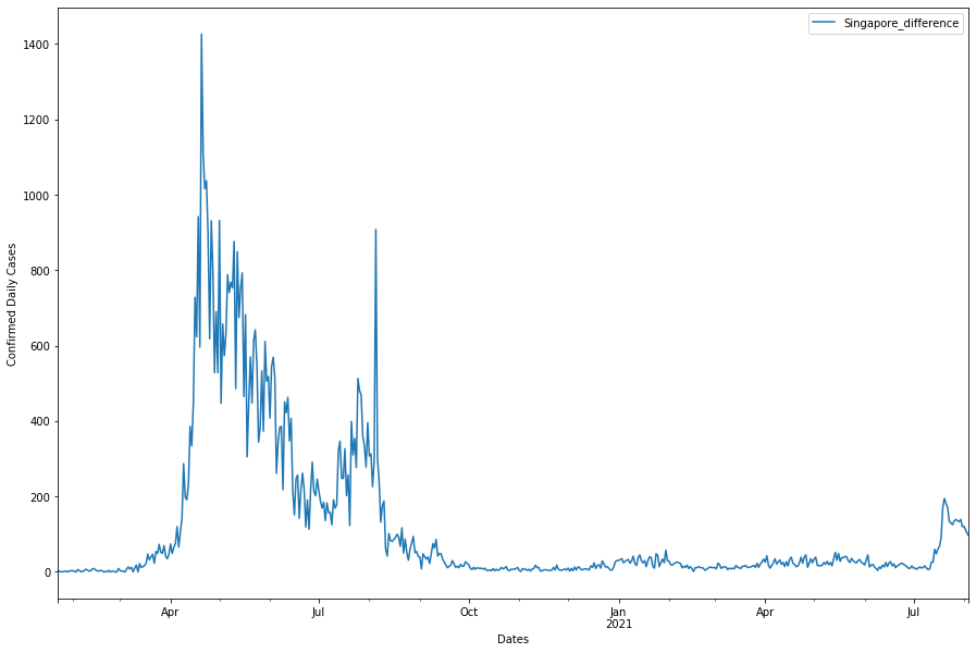
Plotting Daily Cases: Singapore
For the sake of this tutorial, we would be taking a look at the effectiveness of the different measures against COVID19 in Singapore only. Recall that we can plot the daily cases against time like so:
fig, ax = plt.subplots(figsize = (15,10))

asean_daily_df['Singapore_difference'].plot(ax=ax)
ax.set_ylabel('Confirmed Daily Cases')
ax.set_xlabel('Dates')
ax.legend()
plt.show()
From this wiki page, we can have a table of dates, types of measures and details of measures!
| Date (YYYY-MM-DD) | Detail of Measure | Type of Measure (Tighten / Relax) |
|---|---|---|
| 2020-04-07 | Circuit Breaker | Tighten |
| 2020-04-21 | Circuit Breaker 2 | Tighten |
| 2020-06-02 | Phase 1 Day 1 | Relax |
| 2020-06-19 | Phase 2 Day 1 | Relax |
| 2020-12-28 | Phase 3 Day 1 | Relax |
| 2021-05-08 | Phase 2 part 2 Day 1 | Tighten |
| 2021-05-16 | Phase 2 HA Day 1 | Tighten |
| 2021-06-14 | Phase 3 HA Day 1 | Relax |
| 2021-07-12 | Phase 3 HA Groups of 5 Allowed | Relax |
| 2021-07-22 | Phase 2 HA Day 1 | Tighten |
From this table, we can easily use the datetime package to label these dates for us!
from datetime import date

circuit_breaker_date = date(2020,4,7)
cb_2_date = date(2020,4 ,21)
phase_1_date = date(2020, 6, 2)
phase_2_date = date(2020, 6, 19)
phase_3_date = date(2020, 12, 28)
phase_3_HA_date =  date(2021, 5, 8)
phase_2_HA_date = date(2021, 5, 16)
phase_3_HA2_date = date(2021, 6, 14)
phase_3_5_date = date(2021, 7, 12)
phase_2_HA2_date = date(2021, 7, 22)


#We are going to use a dictionary here to identify each date's details!
dates_dist = {circuit_breaker_date:['Circuit Breaker', 'Tighten'],
              cb_2_date:['Circuit Breaker 2', 'Tighten'],
              phase_1_date:['Phase 1', 'Relax'],
              phase_2_date:['Phase 2', 'Relax'],
              phase_3_date:['Phase 3', 'Relax'],
              phase_3_HA_date:['Phase 3 HA', 'Tighten'],
              phase_2_HA_date:['Phase 2 HA', 'Tighten'],
              phase_3_HA2_date:['Phase 3 HA2', 'Relax'],
              phase_2_HA2_date:['Phase 2 HA2', 'Tighten'],
              phase_3_5_date:['Group of 5 Allowed', 'Relax']}

col_dict = {'Tighten': 'r', 'Relax':'g'}
fig, ax = plt.subplots(figsize = (15,10))
asean_daily_df['Singapore_difference'].plot(ax=ax, label = '')

#Iterate over the keys of the dictionary. aka the different dates
for dates in dates_dist:
    #plot the date, for colour, use the dictionary to see if "Tighten" or "Relax"
    #Then use that as a key for our col_dict to specify our colour (red / green)
    ax.axvline(dates, color=col_dict[dates_dist[dates][1]],
               linestyle='--', lw=2)

ax.axvline(circuit_breaker_date,color = 'r', label ='Tighten',linestyle='--', lw=2)
ax.axvline(phase_3_date,color = 'g', label ='Relax',linestyle='--', lw=2)
ax.set_ylabel('Confirmed Daily Cases')
ax.set_xlabel('Dates')
ax.legend()
plt.show()
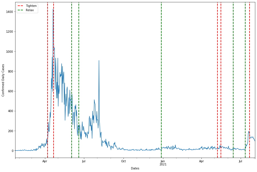
The graph might be hard to see as it is roughly 2 years worth of data squeezed into a single axis, we might want to split into two graphs to visualise.
fig, ax = plt.subplots(figsize = (15,10), nrows = 2)
asean_daily_df['Singapore_difference'].plot(ax=ax[0], label = '')
asean_daily_df['Singapore_difference'].plot(ax=ax[1], label = '')

#Iterate over the keys of the dictionary. aka the different dates
for dates in dates_dist:
    #plot the date, for colour, use the dictionary to see if "Tighten" or "Relax"
    #Then use that as a key for our col_dict to specify our colour (red / green)
    ax[0].axvline(dates, color=col_dict[dates_dist[dates][1]],
               linestyle='--', lw=2)
    ax[1].axvline(dates, color=col_dict[dates_dist[dates][1]],
               linestyle='--', lw=2)


ax[0].axvline(circuit_breaker_date,color = 'r', label ='Tighten',linestyle='--', lw=2)
ax[0].axvline(phase_3_date,color = 'g', label ='Relax',linestyle='--', lw=2)
ax[0].set_ylabel('Confirmed Daily Cases')
ax[0].set_xlabel('Dates')
ax[0].set_xlim(date(2020, 1, 22), date(2020, 12, 31))
ax[0].legend()
ax[0].set_title('Daily Cases in Singapore for 2020')


ax[1].axvline(circuit_breaker_date,color = 'r', label ='Tighten',linestyle='--', lw=2)
ax[1].axvline(phase_3_date,color = 'g', label ='Relax',linestyle='--', lw=2)
ax[1].set_ylabel('Confirmed Daily Cases')
ax[1].set_xlabel('Dates')
ax[1].set_xlim(date(2021, 1, 1), date(2021, 8, 4))
ax[1].set_ylim(-1, 400)
ax[1].legend()
ax[1].set_title('Daily Cases in Singapore for 2021')

plt.tight_layout()
plt.show()
Recap:
| Date (YYYY-MM-DD) | Detail of Measure | Type of Measure (Tighten / Relax) |
|---|---|---|
| 2020-04-07 | Circuit Breaker | Tighten |
| 2020-04-21 | Circuit Breaker 2 | Tighten |
| 2020-06-02 | Phase 1 Day 1 | Relax |
| 2020-06-19 | Phase 2 Day 1 | Relax |
| 2020-12-28 | Phase 3 Day 1 | Relax |
| 2021-05-08 | Phase 2 part 2 Day 1 | Tighten |
| 2021-05-16 | Phase 2 HA Day 1 | Tighten |
| 2021-06-14 | Phase 3 HA Day 1 | Relax |
| 2021-07-12 | Phase 3 HA Groups of 5 Allowed | Relax |
| 2021-07-22 | Phase 2 HA Day 1 | Tighten |
Just by inspecting the rise and fall of daily cases with regards to tightening / relaxation of measures we can summarise all of these in a table:
| Date (YYYY-MM-DD) | Detail of Measure | Type of Measure (Tighten / Relax) | Effects on Daily Cases (Increase / Decrease / No Change) |
|---|---|---|---|
| 2020-04-07 | Circuit Breaker | Tighten | Increase |
| 2020-04-21 | Circuit Breaker 2 | Tighten | Decrease |
| 2020-06-02 | Phase 1 Day 1 | Relax | Decrease |
| 2020-06-19 | Phase 2 Day 1 | Relax | Increase THEN Decrease |
| 2020-12-28 | Phase 3 Day 1 | Relax | No Change |
| 2021-05-08 | Phase 2 part 2 Day 1 | Tighten | Increase |
| 2021-05-16 | Phase 2 HA Day 1 | Tighten | Decrease |
| 2021-06-14 | Phase 3 HA Day 1 | Relax | No Change |
| 2021-07-12 | Phase 3 HA Groups of 5 Allowed | Relax | Increase |
| 2021-07-22 | Phase 2 HA Day 1 | Tighten | Decrease |
From the table, five out of ten changes in COVID19 measures resulted in a decrease in daily cases. On a superficial glance, it seems that tightening or relaxation of measures does not affect daily cases.
However, there are many more dimensions in this dataset such as, clusters, linked / unlinked cases / waves etc. We would not be going into all these things as they would turn this workshop in a statistics course and, we would probably be working for various govenments to analyse all the statistics ;).