Exploration of COVID19 dataset: Bar Chart
Recap
First, customary importing of packages and data if you haven't already done so from the previous sections.
import pandas as pd
import matplotlib.pyplot as plt

month_int = '08'
day_int = '03'

df = pd.read_csv(f"https://raw.githubusercontent.com/CSSEGISandData/COVID-19/master/csse_covid_19_data/csse_covid_19_daily_reports/{month_int}-{day_int}-2021.csv")
ASEAN_countries_list = ['Brunei', 'Cambodia', 'Indonesia', 'Laos', 'Malaysia', 'Burma', 'Philippines', 'Singapore', 'Vietnam']
asean_df = df[df['Country_Region'].isin(ASEAN_countries_list)]
asean_df.set_index('Country_Region', inplace = True)
asean_df_dropped = asean_df.drop(columns = ['FIPS', 'Admin2','Province_State', 'Last_Update', 'Lat', 'Long_', 'Combined_Key'])
asean_df_dropped
| Confirmed | Deaths | Recovered | Active | Incident_Rate | Case_Fatality_Ratio | |
|---|---|---|---|---|---|---|
| Country_Region | ||||||
| Brunei | 338 | 3 | 280.0 | 55.0 | 77.260145 | 0.887574 |
| Burma | 311067 | 10373 | 220887.0 | 79807.0 | 571.711409 | 3.334651 |
| Cambodia | 79051 | 1471 | 72145.0 | 5435.0 | 472.822161 | 1.860824 |
| Indonesia | 3496700 | 98889 | 2873669.0 | 524142.0 | 1278.390505 | 2.828066 |
| Laos | 7015 | 7 | 3392.0 | 3616.0 | 96.418748 | 0.099786 |
| Malaysia | 1163291 | 9598 | 950029.0 | 203664.0 | 3594.176209 | 0.825073 |
| Philippines | 1612541 | 28141 | 1521263.0 | 63137.0 | 1471.550496 | 1.745134 |
| Singapore | 65315 | 38 | 63252.0 | 2025.0 | 1116.430267 | 0.058180 |
| Vietnam | 174461 | 2071 | 50831.0 | 121559.0 | 179.231087 | 1.187085 |
As you can tell, the table is huge with ~4000 rows. Let us subset our data to just ASEAN countries.
Description of each field (from the github)
-
Country_Region: Country, region or sovereignty name. The names of locations included on the Website correspond with the official designations used by the U.S. Department of State.
-
Confirmed: Total Counts include confirmed and probable (where reported).
-
Deaths: Total Counts include confirmed and probable (where reported).
-
Recovered: Recovered cases are estimates based on local media reports, and state and local reporting when available, and therefore may be substantially lower than the true number. US state-level recovered cases are from COVID Tracking Project.
-
Active: Active cases = total cases - total recovered - total deaths.
-
Incident_Rate: Incidence Rate = cases per 100,000 persons.
-
Case_Fatality_Ratio (%): Case-Fatality Ratio (%) = Number recorded deaths / Number cases.
All cases, deaths, and recoveries reported are based on the date of initial report. Exceptions to this are noted in the "Data Modification" and "Retrospective reporting of (probable) cases and deaths" subsections below.
Bar Charts
From the table itself, there are many types of barcharts we can plot out. Let us take a look at the Incident_rate against each ASEAN country.
asean_df_dropped['Incident_Rate'].plot(kind = 'bar').set_ylabel('Incident Rate')
plt.show()
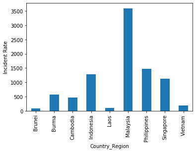
From this barchart, we can instantly tell that Malaysia has the highest incident rate at ~3,500. This means that they have about 3,500 confirmed cases for every 100,000 person in Malaysia.
Likewise, Brunei and Laos have the lowest incident rate at less than a 100 confirmed cases for every 100,000 persons in their respective countries.
Hence, we can see that, assuming Malaysia, Brunei and Laos have the same population, Malaysia would have more of her people infected as compared to the other two countries.
Another interesting statistic we can see is Case_Fatality_Ratio.
asean_df_dropped['Case_Fatality_Ratio'].plot(kind = 'bar').set_ylabel('Case Fatality Ratio (%)')
plt.show()
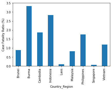
From this barchart, we can tell that Burma has the highest case to fatality ratio. and Singapore have the lowest case to fatality ratio.