Importing Dataset & Bar Charts
Importing Iris Dataset
We can import the dataset either by downloading the dataset or linking it straight from a source (like what we're going to do)
import pandas as pd
import matplotlib.pyplot as plt

df = pd.read_csv("https://raw.githubusercontent.com/darren1998s/darren1998s.github.io/main/iris.csv")

#Remember df.head() shows us the first 5 rows of the dataset.
df.head()
| Sepal.Length | Sepal.Width | Petal.Length | Petal.Width | Species | |
|---|---|---|---|---|---|
| 0 | 5.1 | 3.5 | 1.4 | 0.2 | setosa |
| 1 | 4.9 | 3.0 | 1.4 | 0.2 | setosa |
| 2 | 4.7 | 3.2 | 1.3 | 0.2 | setosa |
| 3 | 4.6 | 3.1 | 1.5 | 0.2 | setosa |
| 4 | 5.0 | 3.6 | 1.4 | 0.2 | setosa |
Bar Chart
Species value_counts()
The basic plotting function is pd.plot which supports easy substitution of plot styles using the kind keyword argument.
We can first make a bar chart containing the number of each species of Iris flowers found in our dataset.
Remember that df['Species'].value_counts() counts the number of unique elements in that column.
df['Species'].value_counts().plot(kind='bar')
<matplotlib.axes._subplots.AxesSubplot at 0x156ffaf0>
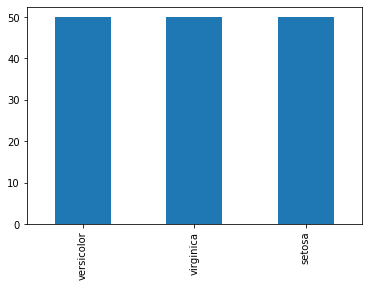
From this Bar Chart, we can see that in our dataset, there are 50 of each species in our dataset.
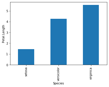
Plotting average of Petal.Length
What if we want to plot a bar chart plotting average Petal.Length for each species of Iris?
import numpy as np

grouped_species = df.groupby("Species")['Petal.Length']
grouped_species.mean().plot(kind = 'bar')

#Don't forget to add the y-axis label for clarity!
plt.ylabel('Petal.Length')
plt.show()
However, most barcharts, while counting averages, needs to have standard error. Since there is no function that calculates standard error for us, we would need to make our own function (se).
Recall that standard error is the formula:
\[se = \frac{\sigma}{\sqrt{n}}\]sd = np.std and we can get n with .count().
def se(data):
    return np.std(data) / np.sqrt(data.count())

grouped_species.agg([np.mean, se])
| mean | se | |
|---|---|---|
| Species | ||
| setosa | 1.462 | 0.024313 |
| versicolor | 4.260 | 0.065788 |
| virginica | 5.552 | 0.077265 |
Now we can plot and specify the error bars with the argument yerr = 'se'.
grouped_species.agg([np.mean, se]).plot(kind = 'bar', yerr = 'se')

#Don't forget to add the y-axis label for clarity!
plt.ylabel('Petal.Length')
plt.show()
From the barchart above, we can conclude many things on first glance:
-
I setosa has the lowest mean Petal Length, followed by I versicolor then I virginica.
-
The standard error of Petal Length for each species are extremely low, signifying very little variance within species.