Utilizing Other Graphical Plot
Bars charts and Scatter Plots
Here we would explore how one would be able to plot scatter graphs, histograms and bar charts.
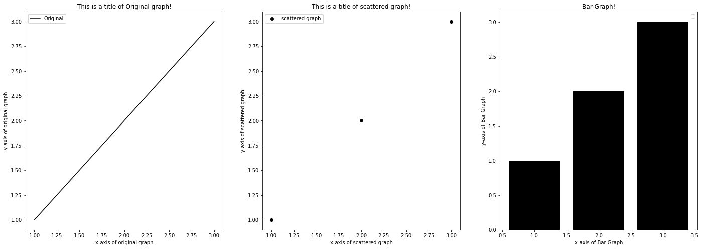
For this first example, we are going to show you how to plot a lineplot, scatter plot and a bar plot using the same set of data.
The important functions to look for in this code block are ax[].plot(), ax[].scatter and ax[].bar!
x = [1,2,3]
y = [1,2,3]

# Creating a subplot with 1 row and 3 columns
fig, ax = plt.subplots(nrows = 1, ncols = 3, figsize = (24,8))

# Lineplot
ax[0].plot(x, y, color = 'k', label = 'Original')
ax[0].set_xlabel('x-axis of original graph')
ax[0].set_ylabel('y-axis of original graph')
ax[0].set_title('This is a title of Original graph!')
ax[0].legend()

# Scatter plot
ax[1].scatter(x, y, color = 'k', label = 'scattered graph')
ax[1].set_xlabel('x-axis of scattered graph')
ax[1].set_ylabel('y-axis of scattered graph')
ax[1].set_title('This is a title of scattered graph!')
ax[1].legend()

# Bar plot
ax[2].bar(x, y, color = 'k')
ax[2].set_xlabel('x-axis of Bar Graph')
ax[2].set_ylabel('y-axis of Bar Graph')
ax[2].set_title('Bar Graph!')
ax[2].legend()

plt.show()
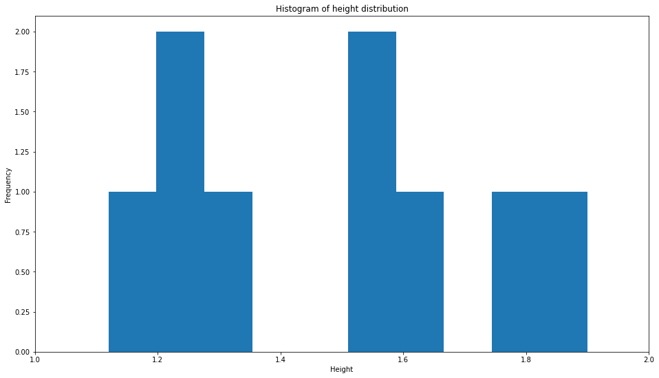
Histograms
What if you would like a histogram? Since histograms makes use of only one variable and then plots their frequency, naturally the syntax would be a little different. The function plt.hist() takes in arguments x which is the dataset you would like to visualise and bins. bins specify how many discrete columns your dataset would be split into.
For this example, I would be utilising a list containing the different heights associated with people.
# Mock Data List
H = [1.34,1.24,1.12,1.25,1.56,1.78,1.60,1.55,1.9]

# Our histogram bins here would be 10, there would be 10 discrete bars
plt.hist(H, bins = 10)

# We limit the x-axis from 1 to 2.
plt.xlim(1,2)

# Labelling
plt.xlabel('Height')
plt.ylabel('Frequency')
plt.title('Histogram of height distribution')
plt.show()
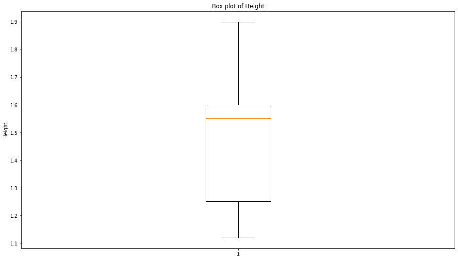
Boxplots
Similarly, we could use the same mock data as before and plot a boxplot to visualise the median and the different quartiles of our data. This can be done using plt.boxplot()
# Mock Data List
H = [1.34,1.24,1.12,1.25,1.56,1.78,1.60,1.55,1.9]

# No additional arguments
plt.boxplot(H)

#Labelling
plt.ylabel('Height')
plt.show()